Butter + Crumb
Brand Identity — Café & Bakery
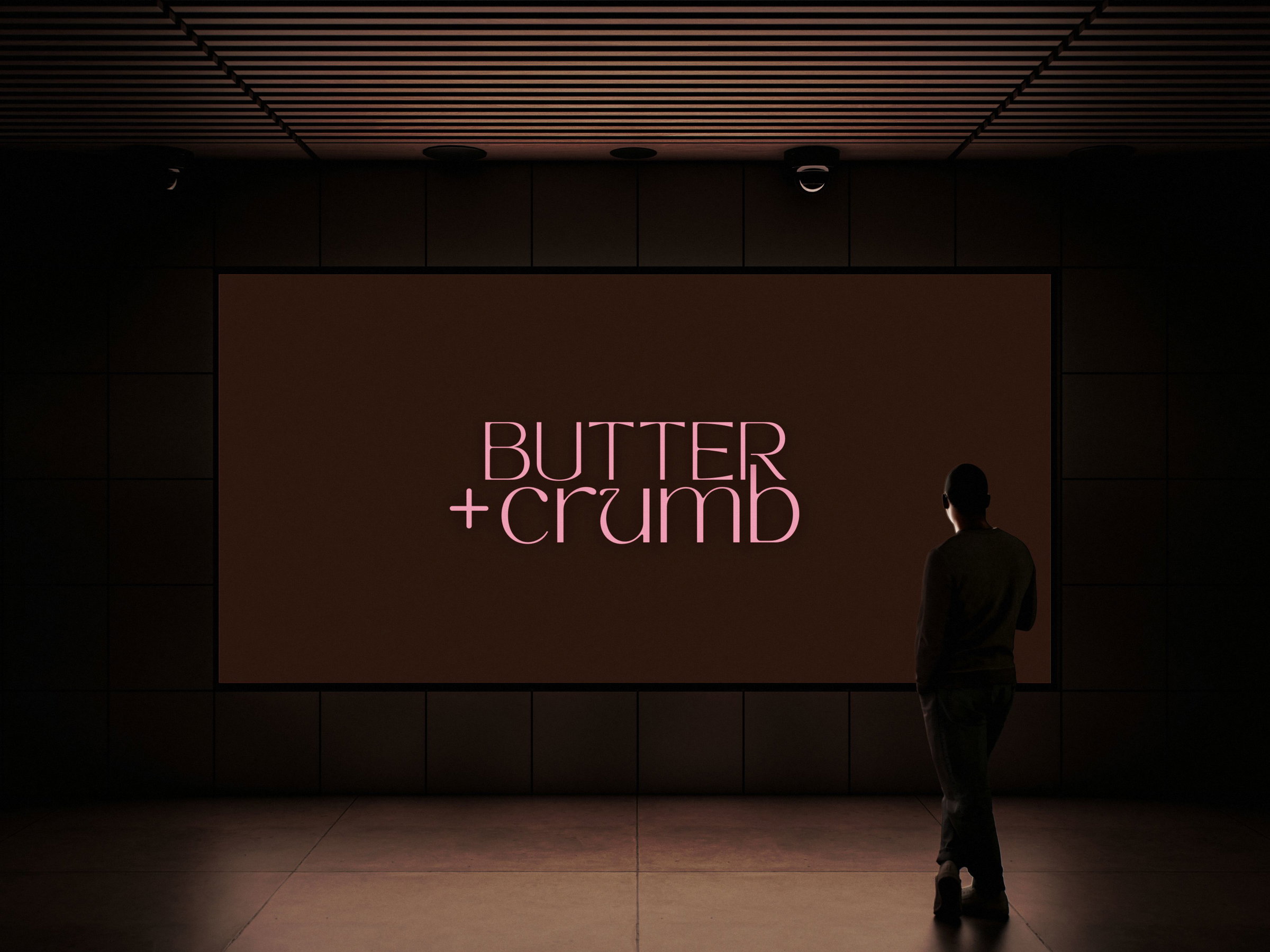
Butter + Crumb is a bakery café brand concept that captures the warmth of a space that smells like browned butter and feels like home. The identity blends refined typography, soft neutrals, and a modern cosiness that makes you want to stay a little longer.
Case study overview
Butter + Crumb's brand design answers the question: what does a bakery look like when it's built with as much care as everything it serves? The goal was warmth and mindful design — the kind that small business owners pour into every product, reflected in every visual.
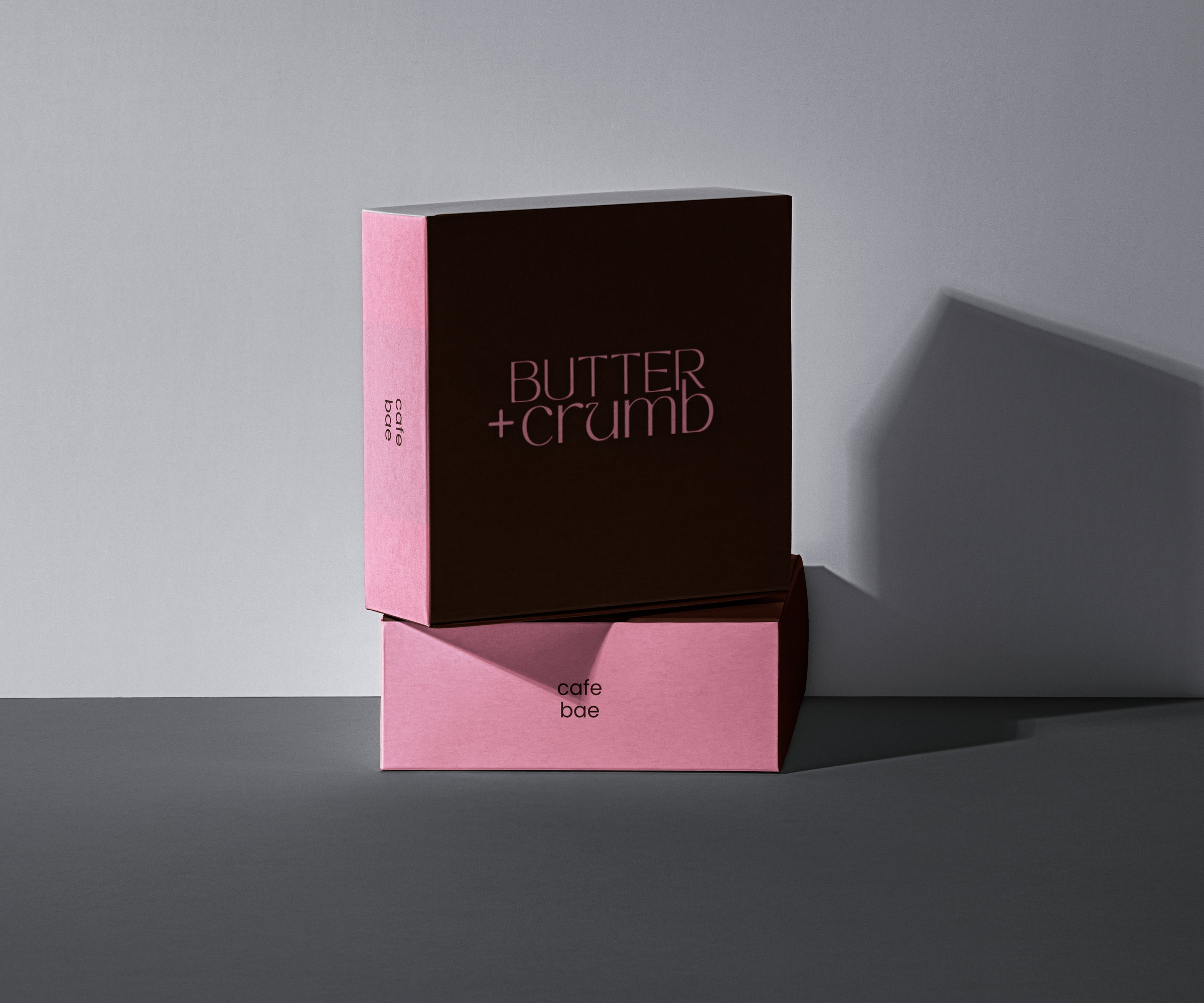
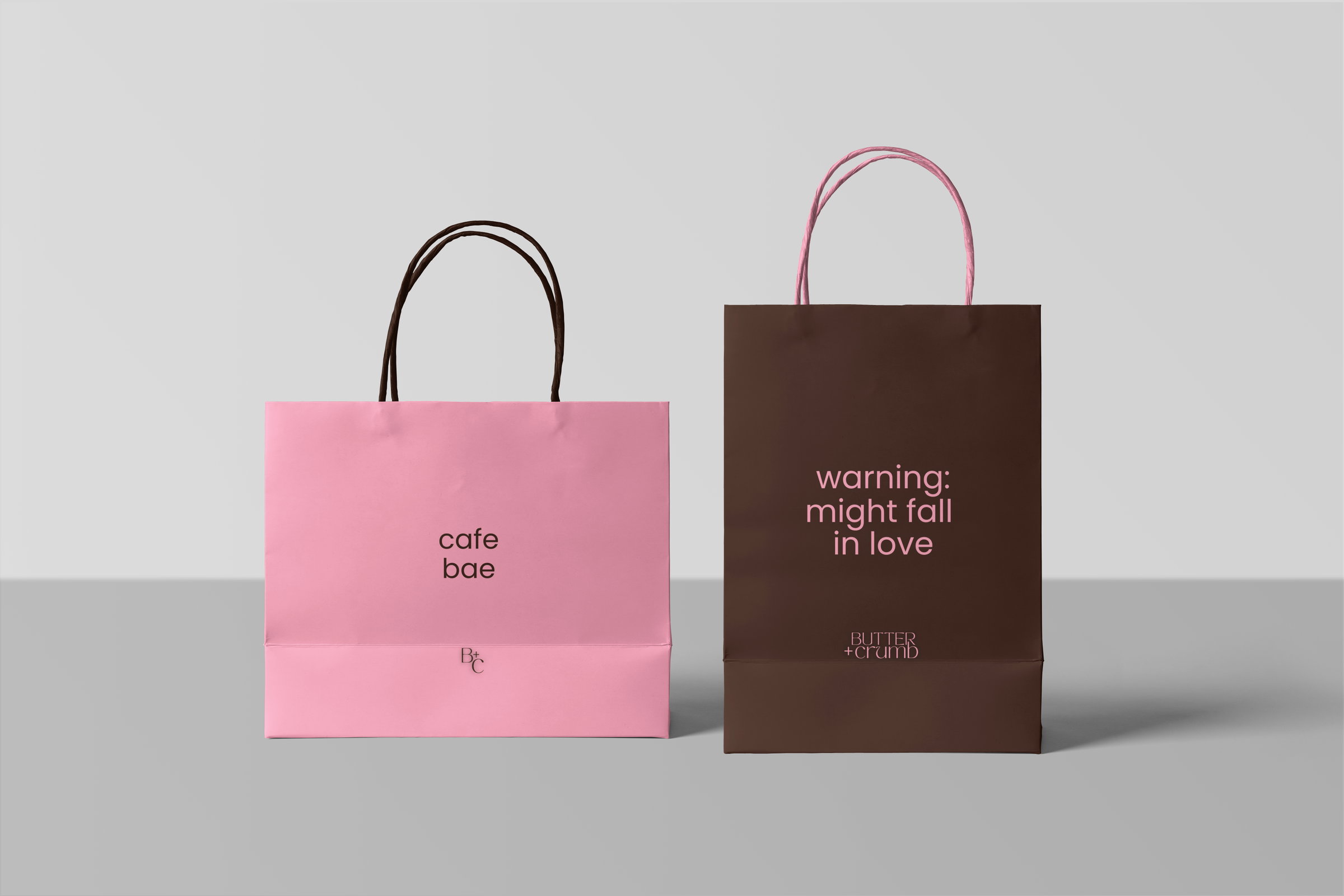
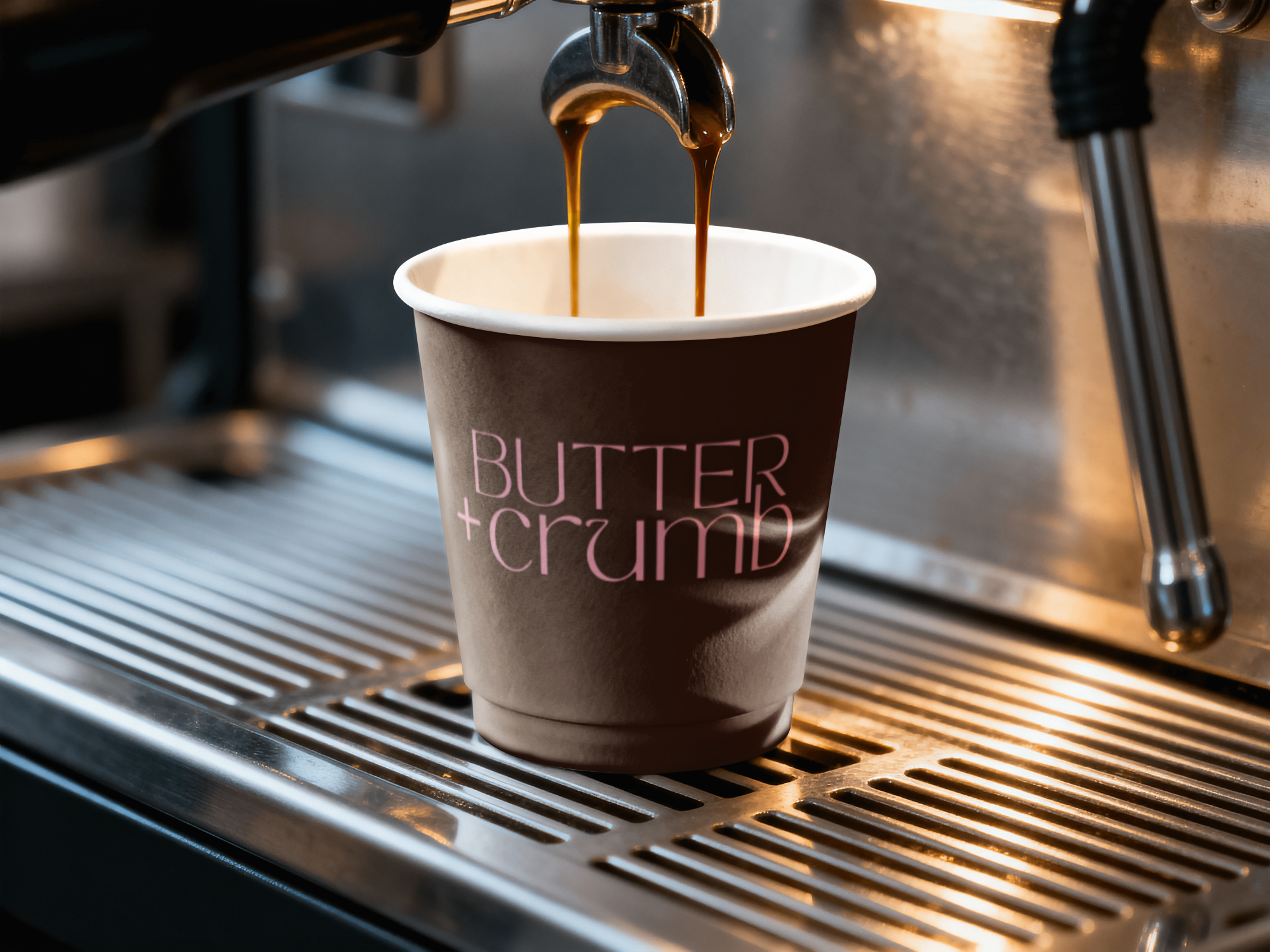
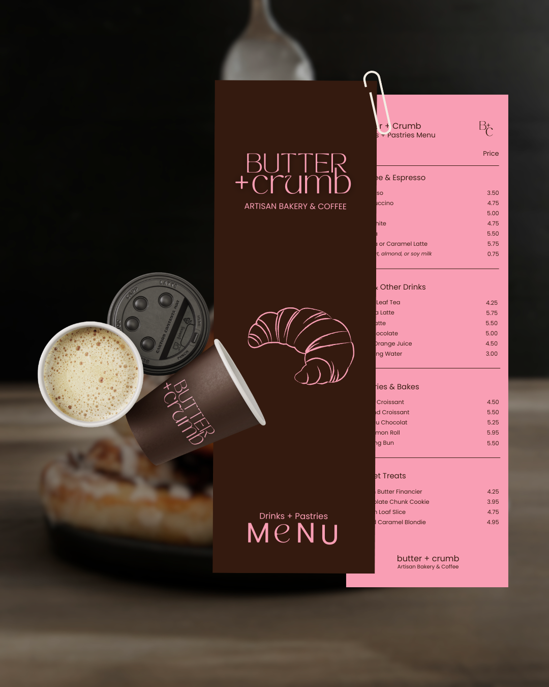
The identity combines soft neutral tones with refined, editorial typography and a cosy modern aesthetic. The deep chocolate brown and blush pink palette feels familiar without being generic. On packaging — from pastry boxes to espresso cups — the brand is immediately recognisable and effortlessly elegant.
Butter + Crumb shows what becomes possible when strategic brand design meets genuine storytelling. Made especially to inspire small Muslim business owners on what their brand could look and feel like, in sha Allah.